How To Use Application
The application can be navigated using the sidebar with five options of Home | Compare Airports | Deep Dive | States | Preferences.
Home
Home provides the description of the project and the team members. It also includes an overview of 10 interesting days for air travel in 2017.
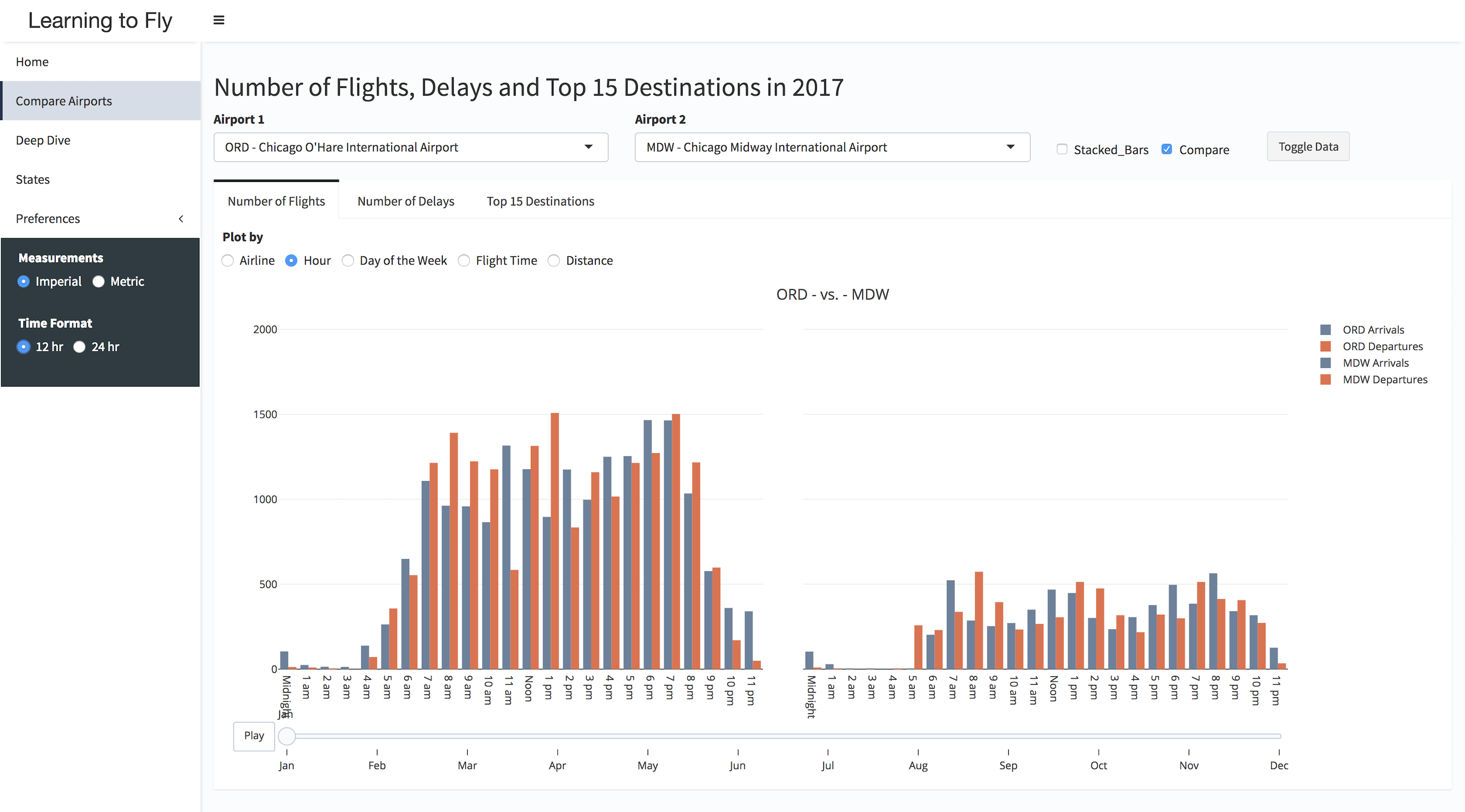
Compare Airports
Compare Airports allows the user to view data from two airports across months by filtering the data using different parameters. The user can toggle between the plots and tables for the data. In addition to that user has the ability to change the mode of the plots from Grouped plots to Stacked plots. Also user can either focus on two airports individually or compare their data using the "Compare" checkbox. For the two airports selected by user, he/she can view the following data:
- Number of Flights: Displays the number of Arrivals and Departures which can be explored by Airlines , Hour, Day of the Week, Flight Time and Distance.
- Number of Delays: Number of delays by type of delay along with the percentage of total number of delays over total number of flights.
- Top 15 Destinations: Displays the numbers for the most common 15 arrival and destination airports.
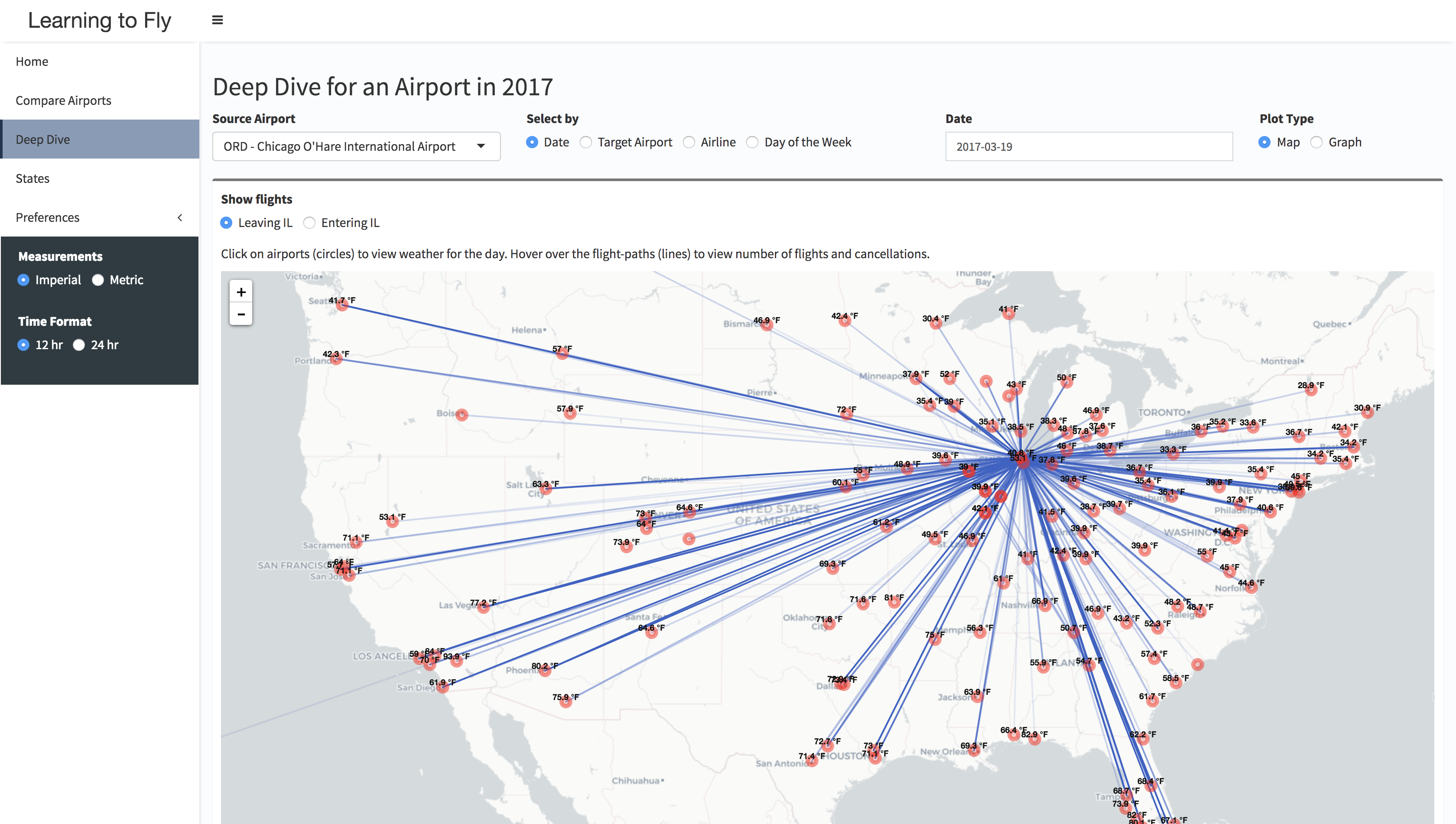
Deep Dive
Deep Dive provides further insights of the data for a chosen source airport across months. The user can view the graphs as well as the maps(heatmap or leaflet map) for all the statistics. In addition to that the user can get data for Date | Target Airport | Airline | Day of the Week.
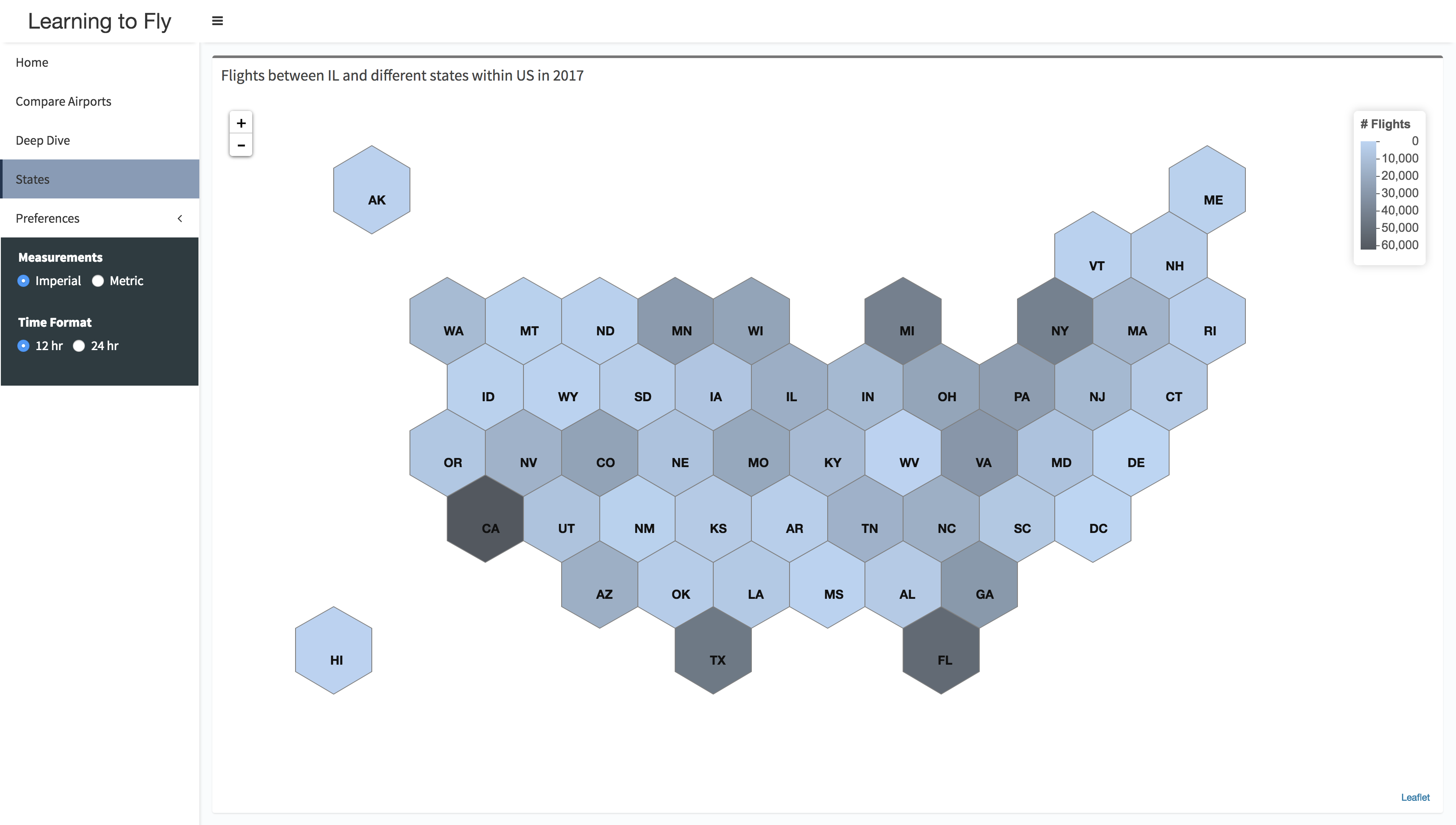
States
States component contain the hexagonal map showing information about the flights between Illinois and different states within US.
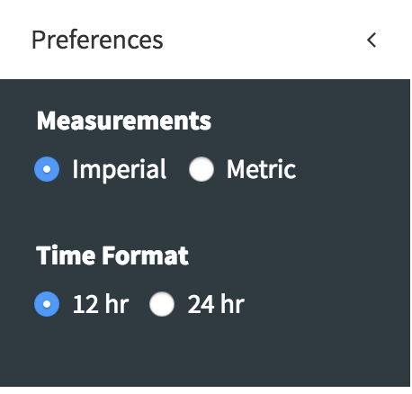
Preferences
Preferences allows the user to switch between Measurements(km|miles) and Time Format(12hr|24hr).